Characteristic Curve Control


Back to 'Dry Plate Photography Index' Previous Next

'Perhaps no art, science or craft has evolved by such an extraordinary combination of pure science, pure witchcraft, and wishful thinking as that which constitutes the popularly accepted procedures in photography.  In the development processes above all others, weird mumbo jumbo persists and flourishes.'

Ansel Adams, The Negative,1948, p67.

   Variations on Pancho, side-by-side on a light table.

Be it art, science, or magic, there is a wonderful amount control of density and contrast possible with the old emulsions.  I'm currently working with a simple matrix combination of two emulsion recipes and four developers.  It is my goal to make a well-exposed plate, no matter the lighting circumstances, and then print that plate on a custom complimentary paper/developer combo, resulting in a final print that reflects my original visualization.  Dream Big!

The concept of curve control has been known by every photographer who has ever shot b&w sheet film: 'Expose for the shadows and develop for the highlights'.  By adjusting the length of exposure and the time of development, you can control the appearance and printability of your plates.   The following four Panchos illustrate this idea.


Handling the Light

All plates were made in a 4x5 inch Zone VI field view with a modern, coated 150mm lens.  The four top images are the flatbed-scanned dry plates.  The images below them are their corresponding positives, flipped and inverted with no other Photoshop manipulations.

From the left:  

  1. 'Pancho #1'. 'TLF  1': July, mid-afternoon, bright overcast, facing east.  8 seconds at f/22.  5 minute development in 'Def 55dwr'.
  2. 'Pancho #2'.  Same batch of emulsion, exposed right after #1 and with the same lighting conditions.  5 seconds at f/22.  8 minute development in 'Def 55dwr'.

#2 is a little thin in the shadows, but the highlights look good.  If I had simply increased the exposure and left the development unchanged, the highlights would likely have become blocked and hard to print.  By increasing the exposure and pulling the development time, the shadows filled in while leaving the highlights unchanged.

  1. 'Pancho #3'.  Exposed early on a July morning, facing east.  The weather was a heavy overcast, almost to the point of fog (i.e. pretty typical summer a.m. Oregon beach weather).  I gave the plate a full 20 sec exposure at f/22 and six minute development in 'Def 55dwr'.  The emulsion at the bottom of the plate was a little thin, but it's still a beautiful plate - if anything, a bit dense.  Note an important fact here:  The image is NOT true to reality.  There is no indication that it was dark enough outside that I had all the lights on in the house.  Since this is a common lighting condition for me to have to deal with, I'm very glad to have the creative control.  Nevertheless, if I had wanted to convey the dark, flat conditions that actually existed, I would have decreased both the exposure and development.   When I get past the testing part of things, and I'm not trying to squeeze a dozen different ideas into one batch of plates, I will do what I have always done with film — bracket.
  2. 'Pancho #4'.  This was the opposite lighting condition from #3:  Bright, mid-afternoon July sunshine.  I used PMK Pyro, which I have decided is a very slow developer.  But, it does cut the contrast.  The paradox of this image is that although the sun was blazing, I exposed the plate for 20 sec at f/22 and developed for 10 minutes in the PMK.   The luminance and sense of brightness is preserved, while the harsh contrast is controlled.
Above: Digital prints from the flatbed-scanned plates: Pancho #'s 1,2,3, and 4.

Photoshop manipulations were restricted to an unsharp mask, 'curves' and selective use of the 'burn' (shadows) and 'dodge' (highlights) tools.  It's interesting how digital prints from scanned plates are different from prints made in an enlarger.  The physical differences of the processes affect the appearance.  Except for the value-rendering idiosyncrasies of a 'color blind' emulsion, the enlarged prints would be hard to distinguish from an enlargement of modern film.  The scanned plates, on the other hand, are seriously 'different'.  The light has bounced around in the glass, causing an almost infrared look, and the halation artifacts are far, far more visible than in the enlarged prints.

Below: Enlargements of the same plates.  Zone VI enlarger, Ilford Multigrade FB glossy, Agfa 108 high contrast paper developer.   Pancho #3 would have been better printed with a standard contrast developer, but I wanted to keep things as comparable as possible.
#1 #2
#3 #4


All Light Is Not Equal

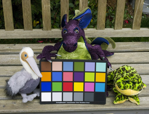
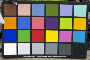
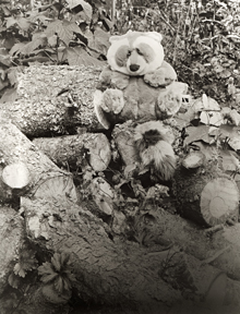
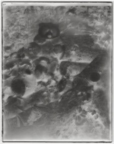
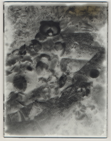
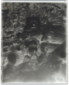
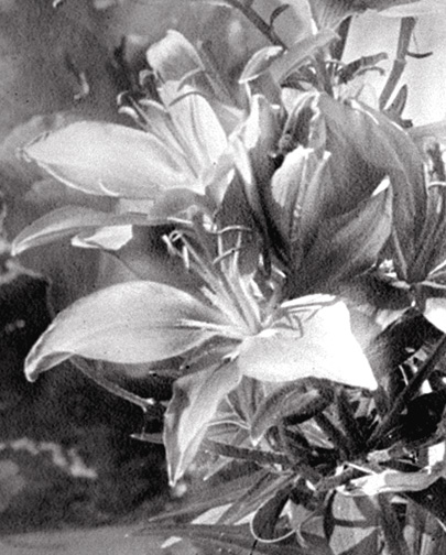
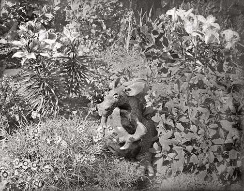
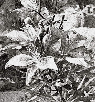
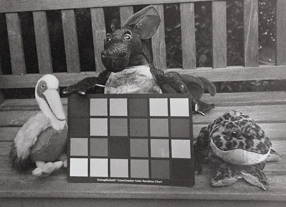
Since the beginnings of photography, rendition of color and brightnesses have been conventionalized by the limitations of the negative material.  In the early days, with the color-blind plates sensitive only to blue light, we became accustomed to white skies, dark lips, and very dark foliage.  Later, with orthochromatic emulsions, responding to all parts of the spectrum except deep orange and red, foliage could be rendered more faithfully, but skies were still light and blank, lips still dark, and the rendition of clouds in landscape was considered a great feat.  But with the appearance of the panchromatic emulsions, responding to the entire visible spectrum, we grew accustomed to dark skies (exaggerated by the use of filters), light lips, and many other representations that have become as "conventional" as those of earlier times.

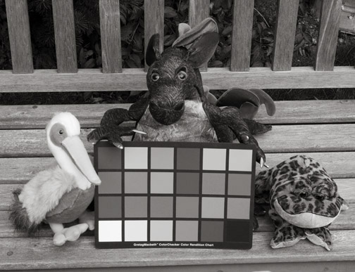
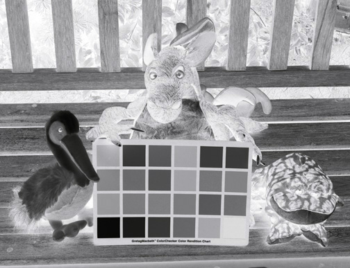
The modern photographer, however, has such a wide choice of negative materials, together with filters to modify their effects, that he need be bound by no conventions of expression.  After learning — through experience plus logical experimentation — the differences between emulsion types, and the effects of various filters on tonal values and contrast, he has available a stimulating gamut of interpretive possibilities.'

Ansel Adams, The Negative, 1948, pp 4-5. 

I don't know if Ansel foresaw the disappearance of 'a wide choice of negative materials', at least in 1948, but what he said then can hold true for us today — if we take matters into our own hands.  Learning a few lab skills is the least of it.  The challenge is learning to unlearn 'panchromatic visualization' and process-by-quantification.

The first idea to rethink is 'speed'.  Beyond a general expectation that one recipe is usually faster/contrasty'er/grainy'er than another, each handmade batch of emulsion will be a little different from another, even if the recipe is identical.  The infinity of chemical and physical reactions involved with emulsion making is the reason Kodak, et al, obsessed about control.  Their obsession (if not their secrecy) was justified.  They were commercial operations, selling to a public that they, in turn, were teaching to demand consistency.  In very short order, the public had been taught that photographic materials came from factories. 

The effective speed of a plate will be affected not just by the emulsion-making steps, but by your choice of developer, by the time of day (i.e. color temperature), filter factors, and where on the characteristic curve of the emulsion you looking and what exposure/development time combination you choose to maximize the quality of plate.  I highly recommend reading The Negative, 1948 edition.  No one has ever said it better than Mr. Adams.  Some people read A Christmas Carol once a year.  I read The Negative.

Second, treat each new batch of plates as a fresh, unknown set of qualities.  I always coat four 4"x5" plates per batch, no matter what size plates I'm coating otherwise.  For each of my camera/holder sizes I have one holder retrofit with a 4"x5" adapter. (There's more about those in the 'Tools' section.)  Before I take the big plates out in the field, I test the 4"x5"s in my backyard to get a sense of the emulsion.  I keep a couple of developers mixed up (Defender 55dwr and Kodak D-19, plus PMK Pyro if bright sun is expected — a rarity here) to test the plates.   After I know how the emulsion will behave, I can expose and develop the rest of the plates accordingly.

Below, I begin the first of my own explorations into the nature and control of non-panchromatic emulsions.  I start with color temperature, because it is the easiest thing to overlook.  To a color-blind emulsion, all light is not created equal.   I follow this with the first of my work with filters.  In addition to these factors, I hope to start looking into some simple color sensitizing additives someday soon.


Effect of Color Temperature:

Color changes throughout the day and throughout the year.  The warm light of early morning and late afternoon is especially sought after by color landscape photographers (at least those who don't rely on filters or Photoshop).  With non-panchromatic emulsions, there's more going on.  All light isn't equal.

This plate was exposed late in the day.  The sun was still bright, but it was a warm, reddish light.  Because color-blind emulsion isn't sensitive to that part of the spectrum, there was, in effect, much less light available to the emulsion.  I exposed the plate for 10 seconds at f/22 and developed in PMK pyro for 15 minutes.


An interesting quirk of color-blind emulsions: The exposure of the yellow lilies is much more 'natural' than when the exposure was at mid-day.  They print out light gray rather than black, as they would if the plate had been exposed at mid-day under high UV light conditions.   Note, though, the halation around the petals in the enlarged crop.

A digital print from a flatbed scan of the plate.  Photoshop tools are limited to curves, burn, and dodge (plus an unsharp mask to correct the resolution).


On the left, with a crop below: A digital print from the plate photographed on a light table.  The halation obvious in the flatbed-scan is not visible here.


Pete, Puff, and Fred Teach Me About Color

A 2"x1.5" crop from a 4"x5" dry plate exposed with a yellow#8 filter.


This first set of pictures is from a Pentax K20 digital camera.  The K20 faithfully rendered the colors and contrast of the scene.  The monochrome rendition is the color file, desaturated.  The 'negative' is the desaturated file, inverted.


Crops from each of the three K20 versions:

The comparative densities of the b&w blocks are a good representation of what we see in modern panchromatic film.


The set below is from a 4"x5" dry plate (TLF 1) exposed with a modern coated lens, and no filter. 


On the left: A crop from the print above.

It's easy to pick out the characteristic differences in color recording of a color-blind emulsion exposed without a filter. 

Below are the K20 'panchromatic' versions for comparison.


This set is from a 4"x5" dry plate (TLF 1) exposed with the same modern lens and a yellow #8 filter. 

The yellow filter had a marked effect.  The most obvious is the increase in contrast.  But, more interesting is the change in color sensitivity.  The distinction in density between Puff's dark purple body and light green belly is recorded, mostly because the purple recorded more faithfully.  But, it's easy to see the emulsion characteristics that gave the portraits of my Scandinavian great-grandparents swarthy skin, white eyes, and dark lips.

Below, upper left: Crop from the 'Yellow filter' print.  Upper right: Crop from the 'No Filter' print. And, beneath them the K20 'pan' renditions — again, for comparison.

And because Pancho wanted in on the act, he got his picture taken with a yellow filter.  He was sitting in open shade, but the filter rendered the scene in high contrast with very thin shadow recording. 

In addition to filters (and soon, the addition of various sensitizers) I'm interested in the effect of lens characteristics on what we think of as 'the old look'.  Below is a 4"x5" dry plate (TLF 1) exposed with a very old, uncoated lens.  I love the softness of the image, but from this example, it would seem that modern lens coatings don't effect color rendition.  Note the white semi-circles on side edges of the plate.  This is from exposure masking from the type of plate holder I used for this exposure.  More about that in the 'Tools' section.

MORE TO COME:  The addition of sensitizers to the emulsion.


Back to 'Dry Plate Photography Index' Previous Next


Copyright © The Light Farm