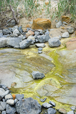
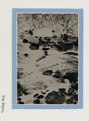
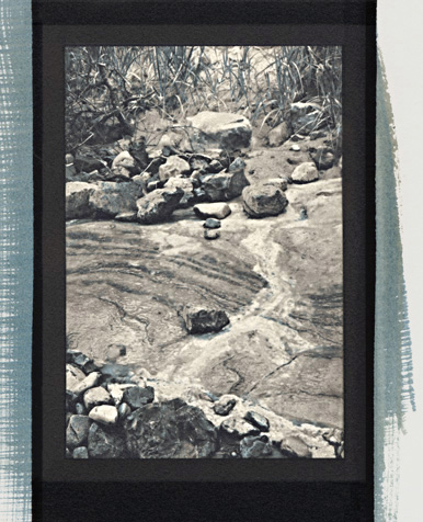
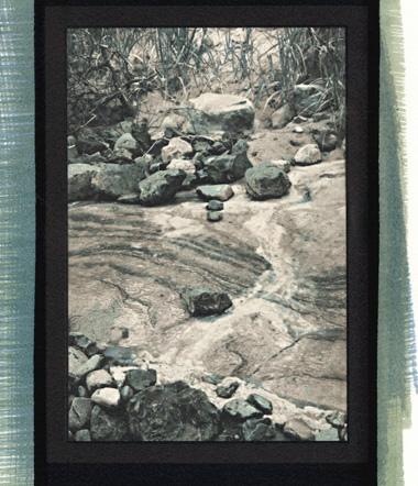
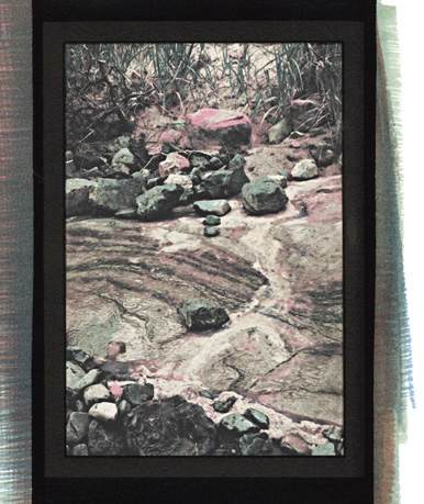
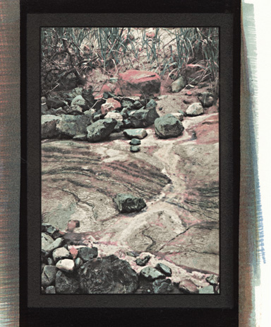
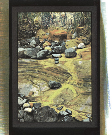
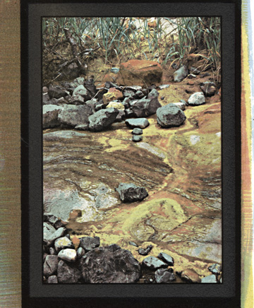
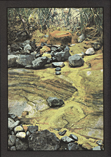
Silvergum Printing

  Basic Overview of 5-Color Printing


 Site Index 

'Rainbow Seep'

Expanding Beyond Three Colors

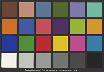
I am often unable to achieve the range and subtlety of color I want with just blue, yellow, and magenta, so I have added cyan and red color layers to my standard workflow.  This page provides a brief summary of the concepts.  Page 4 of 'Silvergum' goes into much greater detail.

You’re not limited to one pigment per color layer. Currently, one of my favorite sets includes Verditer Blue, Quinacridone Rose, Rhodonite Genuine, the Hansa Yellows Light, Medium, and Deep, and Naples Yellow, with the optional additions of Quin Red and Prussian Blue.  Mixing two or more pigments in any layer, and including component pigment overlap, helps tie together the colors in the final print .


Starting Point

My gum prints start in a digital camera. This image was made with a Pentax K10. The only adjustments I made to the factory default settings were to set the contrast as low as possible and to kick the saturation up a notch. I shoot in RAW and work in Photoshop CS2 at 720 dpi.

Crop and re-size to your liking and then save that file, labeled ‘Prime’. This image is ‘RainbowSeep-prime.psd’. This allows all of the subsequent layers to align so that if you want to change a layer, you always have the original file as a reference.

I print all of my layers on Pictorico OHP, on an Epson R2400, with matte black ink on the ‘Best Photo’ setting and gamma 2.2.

Working with a digital file in RAW means you have almost limitless control and potential for creativity. The first image on the left is a straight negative, made by desaturating and inverting. If I made the black and white print from this negative the red rocks and yellow algae would print out very dark and the gum colors would to a large extent be lost.

The middle negative is made by using the hue/saturation slider and selective color tool. I increase the red, magenta, and yellow saturation and then run a +100% black in all three colors, and then invert and sharpen. The red rocks and yellow algae end up very light in the final print.


Digital Negatives and Perfect Registration

On the left: I like to outline each separation negative with silver film tape, leaving a tiny clear space around the image. This preserves the clean, black emulsion and makes the final print look framed.  Obviously, this is strictly a matter of personal taste.


On the right: For every different color layer applied, there is a separate color separation negative. 

One point to love about gum-overs is the ease of negative registration. The first layer aligns with the B&W 'k-layer'. After each successive color layer is completely dried, the print is flattened.  A dry mount press works perfectly for this, but a clothes iron over the print inside a couple of sheets of 2-ply mat board or similar, followed by flattening under a weight works just as well.  On a light table, register the appropriate negative with the image and tape the two together at the top with film tape. When you go to coat, swing the negative up. When the coating is dry, swing the negative back down – still in perfect registration.


Perfect registration after five layers of gum.

In addition to the ease of registering negatives over an initial k-layer, perfect registration is greatly improved by the addition of digital negatives to the process. With each step, the paper shrinks just a bit. I've calibrated that shrinkage (and it's very consistent) for Fabriano paper and my work flow.

Starting with a 3.5 inch high print in mind, I make the original print negative 0.5 mm longer and 0.3 mm wider (disable 'Constrain Proportions'). There is considerable shrinkage during the first step. With each color layer there is just a bit more shrinkage, getting less with each pass. You would think it wouldn't be enough to matter, but perfect registration makes an enormous difference in the finished print, and since with digital negatives custom sizing is one-step easy, why not? A little trial and error and good notes will quickly establish the calibration that works best with a particular set of materials and workflow.


I’ve decided that trying to create adjustment curves for each layer is an exercise in head-banging futility. I advocate a much simpler and straightforward method – a combination of saturation and selective color.

The expanded tutorial on the next page will cover this technique in great detail.

The Gum Layers
1 2 3
4 5 6
  1. BLUE: Prussian blue, Verditer blue and Q Rose. Yellow channel.
  2. CYAN: Prussian blue, Verditer blue and Hansa Yellow Light. Yellow channel.
  3. MAGENTA: Q Rose and Rhodonite. Green channel.
  4. RED: Rhodonite and Naples Yellow. Green channel.
  5. YELLOW: Hansa Yellow Medium, Hansa Light and Naples Yellow. Blue channel. This is the final print that heads this section.

Note: My current personal workflow is Yellow/Blue/Magenta/Cyan/Red.  The color separation baseline worksheets on the following page reflect this ordering.  Starting from that baseline, you can easily adjust the sequence to fit your own work.

6. A final, important note to keep in mind: no matter how hard one strives for repeatability, each print is still a handmade individual, not a reproduction.  I started with two black and white prints of Rainbow Seep. They were identical until the fourth (red) layer. For no discernable reason, the red on one printed darker. So, on the final Yellow layer, I pulled the printing time by a minute. The result is a distinctly different interpretation than #5.


One last lovely bit of artistic control: Hand painting. The image below on the left is a five-color silvergum. The one on the right is a three-color silvergum with Daniel Smith’s “Sap Green” hand painted on the leaves between the magenta layer and the yellow layer.


Copyright © The Light Farm