Field Trip with a Baby
November 11, 2011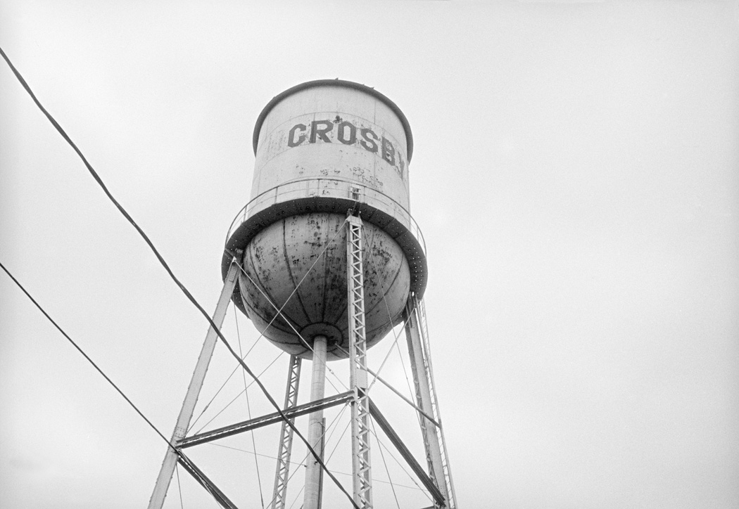
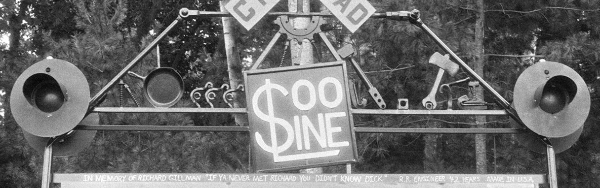
At the end of September, I made one of my frequent visits to Minnesota. It was the perfect opportunity to test 'real world' artisan photography. I'm not particularly inspired as an artist by the area, although some wonderful documentary photography has come from the Upper Midwest. This is Lake Wobegon country. Down the road a hundred miles or so, Garrison Keillor and I went to the same high school, along with Michele Bachmann and Fox News anchor Gretchen Carlson. The town next to Crosby was the setting for the movie, Fargo. There's definitely something here. I just never figured out what before I fled West.
But, 'inspiration' or not, practice is practice, and always a good thing. I packed my Baby Graphic and tripod in my checked luggage, carried the lens in my purse, and mailed loaded film holders to my mom's house. At the end of the week, I mailed the exposed film, still in the holders, back home for processing.
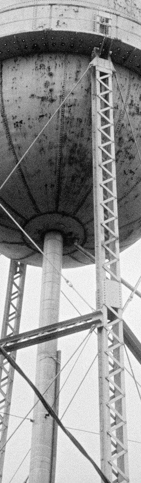
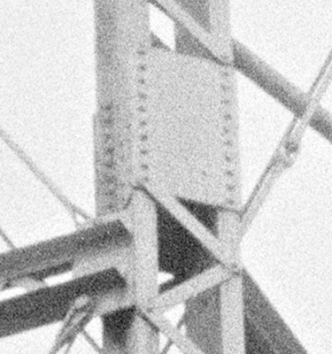
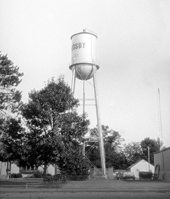
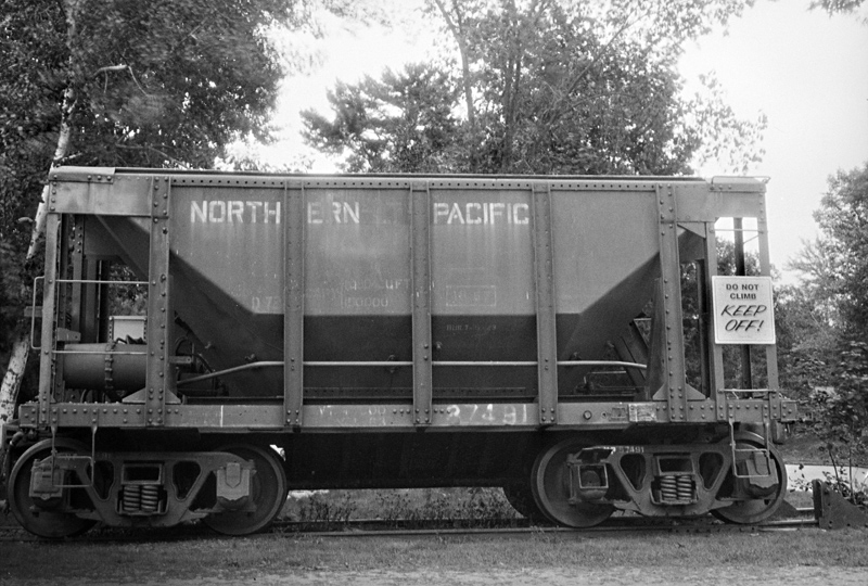
I treated the week (actually just an hour a day) like I were traveling someplace exotic, but instead of scenic or iconic images of Budapest, Barcelona, or Beijing, I searched out as many test examples of the spectral response of colorblind film as I could find. The weather cooperated perfectly. I had a day with bright blue skies, a day of bright overcast, and a dark, gray, rainy day. My favorite image of the week, looking straight up to the bottom of the town watertower, was caught just a second before a rainstorm.
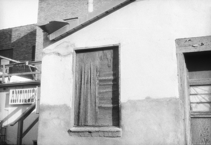
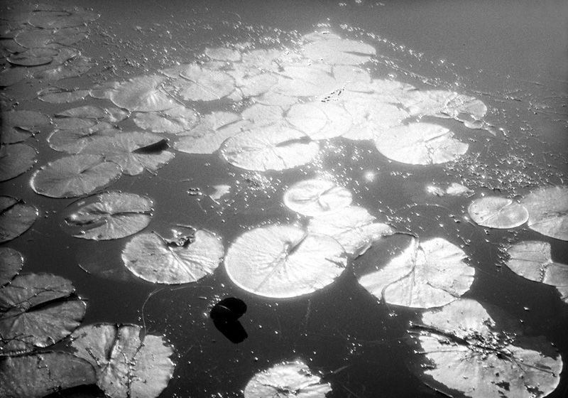
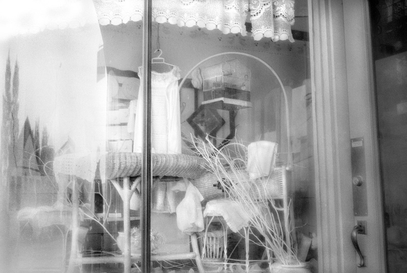
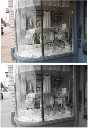
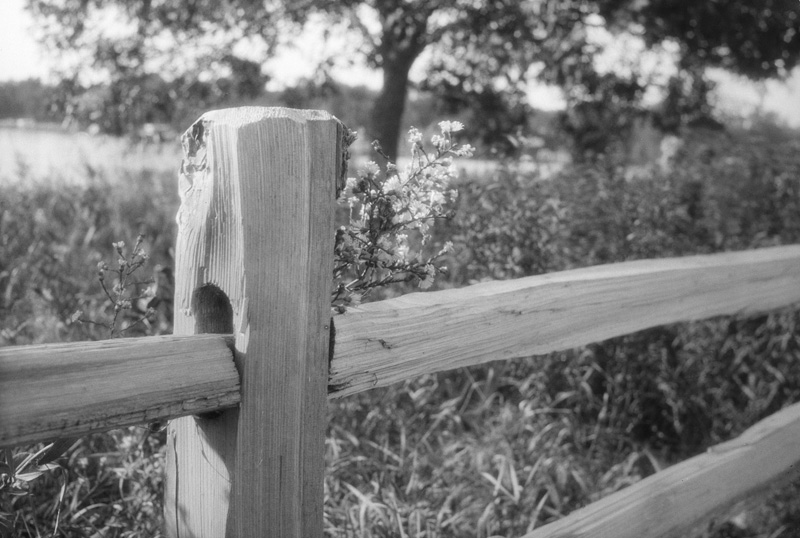
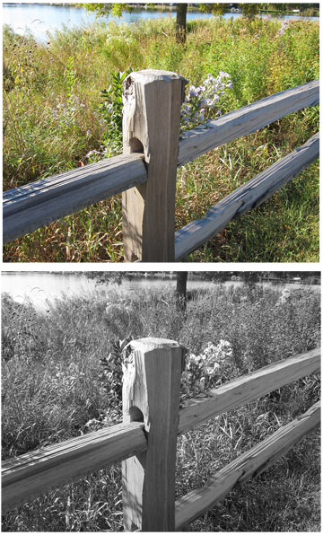
'Colorblind' — also called 'Ordinary' in the old literature and ads — refers to the fact that plain bromide emulsion, unsensitized for color, responds to only UV and blue/violet light. It is particularly insensitive to red. This is why bright blue skies look white (i.e. the negative was very densely exposed there) and reds look black (the negatives are nearly clear there.) Bright blue skies look little different from bright overcast skies.
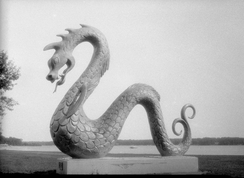
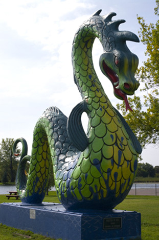
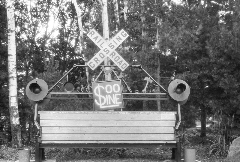
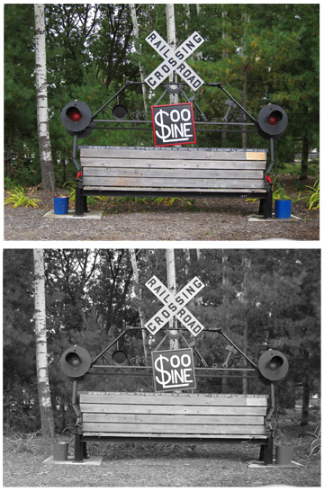
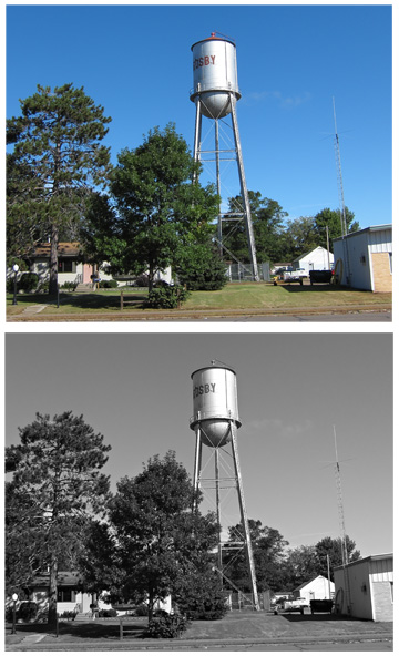
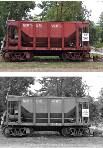
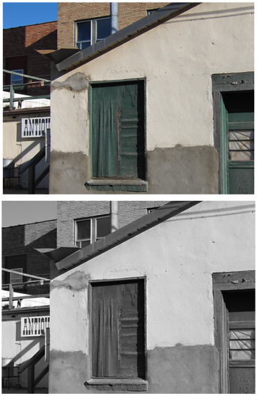
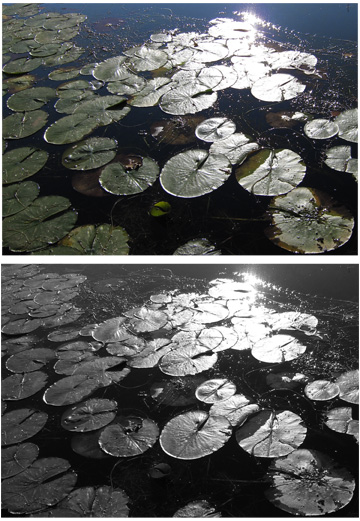
It's not necessarily straightforward, though. There are some interesting aspects to shooting with colorblind, which, of course, is a great reason to "learn the materials" — inside and out. No natural light or surface is purely one color. What looks red has other colors/wavelengths mixed in. White light is a part of all colored light. Blue-green will expose far more than yellow-green. To our panchromatic emulsion-trained eyes, yellow is supposed to be brighter than blue or green. This assumption is turned on its head with colorblind emulsion. On the other hand, shadows that might be dead black with pan film can have the most marvelous luminosity. The following images were shot with colorblind KBr(I) emulsion and minimally post-processed. The images to the right of each are digital color and the same file desaturated. Looking closely at the similarities and differences is the classic "a picture is worth a thousand words".
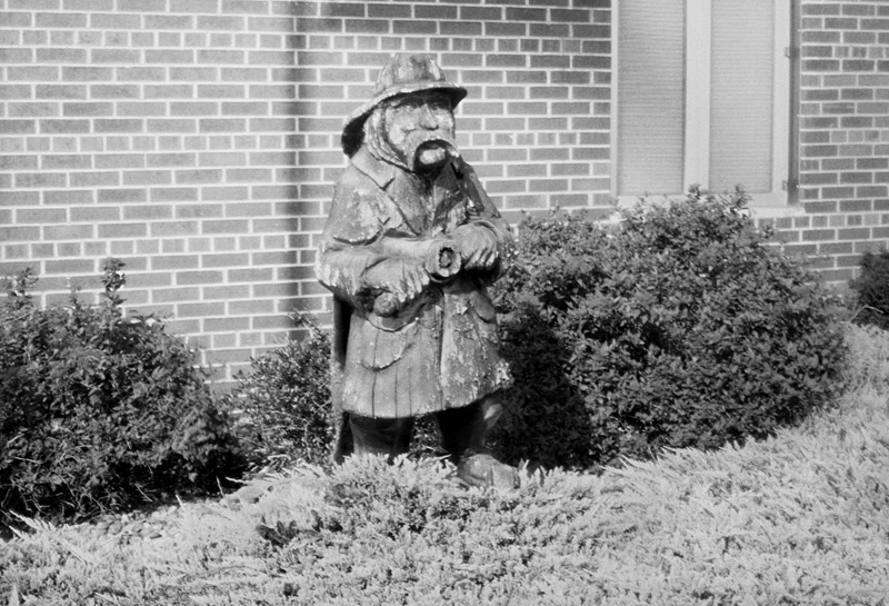
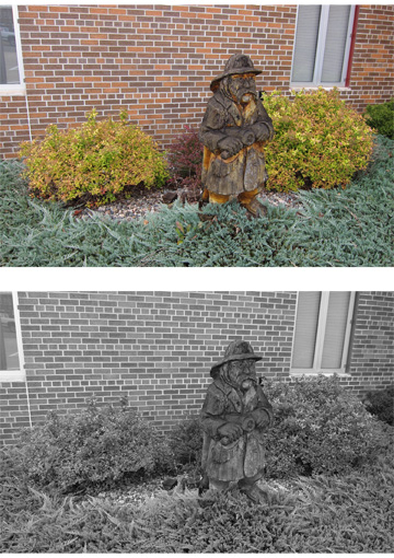
I forgot the color image for the Crosby Fire Department mascot. When I came back the next day it was cloudy, so I missed the cool shadow of the flagpole and waving flag. I managed to forget altogether the color pic of the Crosby Serpent. Luckily, I found one from years ago.