Silvergum Printing

Advanced Tutorial


 Site Index 

Silvergum vs. Traditional Gum

Silvergum is simply a gum print on a base of handcrafted silver gelatin paper.  Commercial silver gelatin paper, at least what is available today, does not have the necessary tooth to hold onto the gum layers, but silver gelatin emulsion on Fabriano Artistico HP is perfect for the task.  The emulsion is tough as nails and doesn't stain no matter how many layers of color are applied.  The print on the left is a 5-color silvergum.  The print on the right is a traditional gum print on Fabriano without additional sizing (FabArt comes internally sized).  It is RGB + K (i.e. 3-color with the addition of a black pigment 'k-layer' laid down before the colors).  Because of the gloss and non-adsorbent surface inherent to a silver gelatin emulsion print, a silvergum print has much greater d-max and color saturation than gum over plain Fabriano HP.  Still, traditional gum printing is a beautiful process in and of itself and an excellent way to practice silvergum printing, even before you have learned to make silver gelatin paper, and it is always an easy and inexpensive way to test color combinations.

On the left, a handcrafted silver gelatin print.  On the right, the same negative used with Daniel Smith 'Lunar Black' watercolor pigment in gum arabic and 15% potassium dichromate solution, coated on plain Fabriano Artistico HP Extra White, exposed and developed the same as any other color layer.  Note that the border has picked up the orange tone distinctive of dichromate burn from overexposure, but the image itself has a beautiful, clean gradation of color.  The k-layer not only adds density and definition to the final print, it makes excellent registration of the individual color separation negatives almost foolproof.  Below, from the left, the stages of traditional gum: Yellow, Y+Blue, Y+B+Magenta, and Y+B+M, plus a second Blue.  With the traditional gum process, as with silvergum, you can continue to add layers to build up both color and density.


From Digital File to Gum-Customized B&W Print

Silvergum prints are a perfect blend of digital technology and handcraftsmanship.  This print, 'Skunks', started in a Pentax K20 camera.  The file moved into Photoshop CS2 and then passed through an Epson 2400 printer on the way to a darkroom that wouldn't have seemed out of place 75 years ago.

The secret to making a b&w 'k-layer' is controlling areas of density with the final colors in mind.  This means that you almost never can get away with a straightforward conversion to monochrome.  Fortunately, Photoshop makes the necessary manipulations very easy.  (Please go here for a brief overview of inkjet negatives.)


Top Left:  A straight color print from the unaltered K20 camera file.

Top Middle:  A straightforward negative made from the color file (i.e. in Photoshop, simply desaturate, invert, and flip.)

Top Right: The resulting print is a realistic monochrome representation of the color image — nice enough as a b&w image , but if the color layers were applied to this print, the result would appear flat and muddy.  The bright, clear yellow of the skunk cabbage flower would be lost.

Bottom Left:  In 'Selective Color - Yellows' remove black (-100% black).  Do the same thing to Greens.  If this were a picture of a red rose, you would select red and/or magenta to adjust.   The resulting negative (Bottom Middle)  reflects the selective density increase and results in the final print (Bottom Right)  having just enough density to record detail, but not so much as to muddy the picture.   For most prints, playing with the appropriate 'Selective Color' will do the trick.  But, don't be reluctant to use the 'Burn' and 'Dodge' tools, sometimes at the 'Actual Pixels' level of detail.  The time spent making good negatives is every bit worth it.  You have complete control of the appearance of your final print. 


Color Separation Negatives: Going Beyond Photoshop's RGB Channels

The simplest way to make color separation negatives is to invert a color file and go into 'Channels' and let Photoshop split out the layers.  But, if you let things run on autopilot you won't get near the separation you need, even if you only print 3-color.  If you are printing with five colors, you definitely need to take a more hands-on approach.

Here's what the RGB color separation negatives that are automatically generated from one unaltered inverted color file look like:  From the left, Red-channel (blue negative), Green-channel (red negative), and Blue-channel (yellow negative).  As with making a digital negative for a b&w print, you'll want to do a bit more.

The original color file, worked up for each individual color and then inverted. 

Each color, for any image, is fully customizable.  More on this follows below.

The resulting color separation negatives.

The following sections go into the fine details of making the negatives for gum printing. At the end of the tutorial there is a link to printable worksheets for your own customized art.


Customizing Your Color Palette

Gum prints can, of course, look any way you visualize them.  They can be close to realistic or a wild departure.  They can be full color or monochromatic.  For my current work, I am trying to come as close as possible to natural colors as they would appear in warm, soft light.  This usually, but not always, means I print at least five separate color layers, with the goal that the component pigments each print true but also blend harmoniously together to reproduce my dream crayon box.  The wonderful gum printer, Katharine Thayer, calls this 'playing well together.'


You'll need to start with a color chart.  I use a GretagMacbeth chart, but you can as easily make your own.  In fact, a chart you make with the pigments you intend to use, in hues you personally find pleasingly, is probably the surest way to calibrate your palette.  I made the chart on the bottom left, trying to match my ColorChecker chart, but there's nothing magic about those colors.  If you know you'll be working with a significantly different color palette, go for it.  Just be sure to try to include as many secondary colors as possible.  If you are making your own color chart, you'll actually be ahead going on to the next step.

The next step is mixing the primary colors together in different pairings to make sure they blend to create good secondary colors.   In addition, you're looking for a combination that makes a good black when all the colors are mixed.  An incompatible mixture, or a mixture out of balance, will drift away from black.  But remember, your palette is your choice, determined by the look you want.  I like clear colors — bright, yet warm and subdued.  I think I'm channeling a color film my dad used in the 1950s.  I don't know what it was, but the memory haunts me.  And, I suspect I've interwoven that memory with the feel of beautiful old, sooty frescos seen by candlelight.  We all carry inside us a 'soul memory' that shapes the dreams for our art.  Making that spirit flesh should be the Holy Grail of every artist.

As you are choosing your colors, try to think more in terms of interrelated color mixes rather than one individual color for each of the layers.  This may be key to a full spectrum of harmonious color on the final prints.  For example, 'Hansa Yellow' in more than one layer helps pull the whole together. 

With the silvergum process, or with straight gum printing that uses a base k-layer, the interaction of the colors with the grays must also be taken into consideration.  Printing a step wedge or scale on your emulsion will give you a surface to experiment with.  Since a silvergum print starts from a good b&w print, true blacks aren't really necessary for a good final d-max.  This allows you a lot of artistic leeway with color choice.

One final determination involves exposure times.  Because silver gelatin emulsion is so tough, there are few of the staining problems that plague traditional gum printing.  Still, a pigment/gum dichromate layer that is over-exposed will turn a nasty orange.  Here's where your step wedge comes in handy again.  The three illustrations below are a step wedge printed over a magenta layer, with the full print on the left followed by two progressive zoom-on crops to the right.  It is easy to see the range from complete underexposure to burnt-on overexposure with a clear magenta layer in between.  More interestingly, a very important final piece of the gum puzzle is apparent here.  Note the final close-up crop on the bottom right.  Just a bit of pigment hung on through the entire development process.  This 'tender zone' plays an integral part in realizing a satisfying final print.  More about this follows.


The following is the workflow developed for the color set I am currently using.  Each set of pigments and the light source they are exposed with will be a little different, but the modifications necessary to completely customize your work, including individual prints, are straightforward and obvious (with a little observation and hands-on practice.) 

First, scan your color chart.  Then, go into Photoshop and with the 'Rectangular Marquee Tool'  divide each block into different density grades using the 'Brightness' slider.   Make an inkjet negative.  For your first experimentations with a new palette, make as many identical prints as your batch of emulsion allows.  I can make about 15  3.5"x5" prints with a half batch of 'I Heart' emulsion on Fabriano Artistico HP 140lb paper.

Although there are many systems for making color separation negatives, ranging from the very simple to the impossibly complex, I want more artistic control than any I've seen.  My strategy for making color separation negatives recognizes that there are no 'one-size-fits-all' canned profiles.


Light Farm Method for Color Separation Negatives

I work in Photoshop CS2,  with just two color management tools — 'Saturation' and 'Selective Color' — in addition to 'Curves', 'Image Size', 'Invert', and 'Channels'.  I haven't taken the time to become familiar with any of the many other available programs, but I have to assume similar tools are available in all of the more recent releases and updates. 

***I will be delighted to publish any and all articles about your silvergum experiences with other programs.***

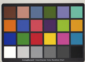
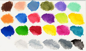
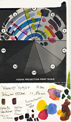
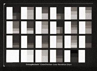
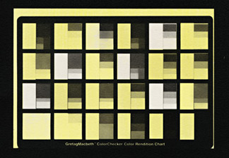
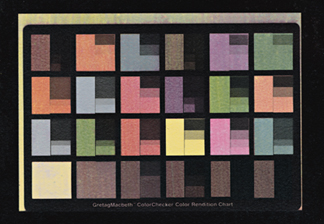
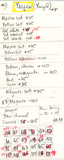
On the left is the worksheet I used to develop the yellow layer for my latest color set.  I wrote down a baseline set of numbers in black, and then, working from the ColorChecker chart, selected for the Y-channel (i.e. Blue), I recorded the 'Info' number for each block.  (In CS2, 'Info' is a tab in the same window as 'Navigator' and 'Histogram'.)  I made a card like this for each color.  As I printed each successive layer of color I judged the color balance on the prints and determined the necessary adjustments.  I recorded the changes in red pen, including the 'Info' values.  Note that 165 is the largest number in any block.  That's because it's at the top of the curve I set for Yellow.  Using an exposure test strip, I determined that any higher a number (i.e. thinner density on the negative) would result in dichromate burn.

Old-fashioned testing coupled with observation is unavoidable (Thank goodness! It's a lot of fun.)  If you are willing to go beyond a paint-by-number approach, you will be able to customize  — quite easily — the negatives and color set for each individual image. 

For each separate color layer, print your color checker print with the corresponding color separation negative created from the baseline numbers. Set your exposure time for just under the time it takes for the highlights to develop a dichromate burn that won't wash off.  Traditional gum advice would have you adjust contrast by changing the ratio of dichromate to gum.  Since we are working with digital negatives, it makes far more sense to adjust the negatives with the 'Curves' tool.  This allows us to standardize pigment/gum/dichromate solutions for a given exposure time.  All the adjustments take place in the choice of color set components and with the negatives, giving us near-perfect control.  For example, in the Yellow card illustrated here, I found that I had to bring the 255 point down to 165 to prevent burn.  I changed the density numbers of the color blocks by adjusting the '0' point.  In this case, changing the '30' to '35' decreased the yellow exposure of a number of the colors.  This becomes important to any subsequent colors that are blends with blue or magenta (i.e. the various shades of orange and green).  We're aiming for balance. 

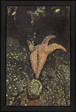
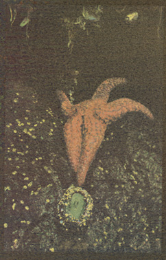
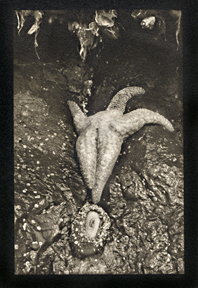
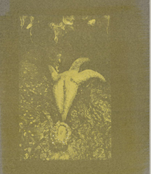
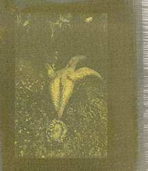
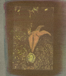
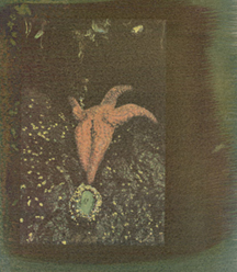
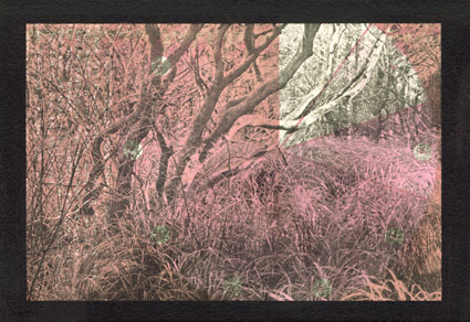
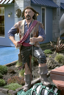
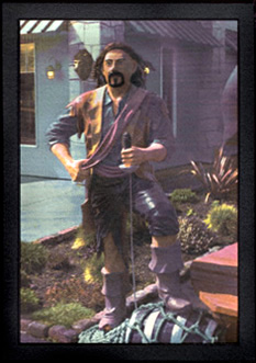
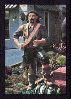
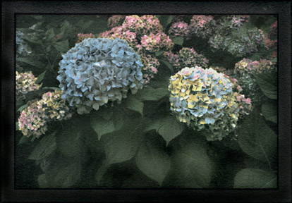
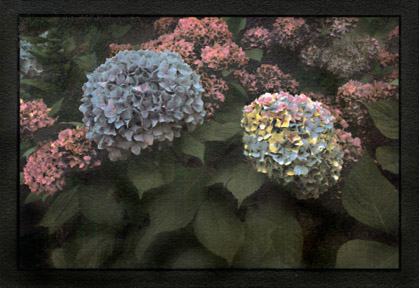
For any image, for any technical or artistic reason, you can adjust the amount of any color component in any layer.   Below is an example, 
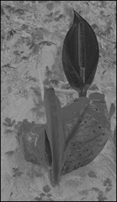
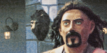
'Aquarium Village Pirate'.  It was my first seriously attempted silvergum print.  I went on a deliberate search for the right picture to experiment with and found this guy.  I was looking for an image that was fun enough to look at over and over as I worked.  I wanted plenty of fine detail to practice registration, a full range of strong colors, and a density range from bright highlights to deep shadows.  On the left is the original digital file (Pentax K20), in the middle is a 3-color print, made with one of my first sets of color separation negatives.  On the right is a print made with a slightly different b&w negative, using my current 5-color set and separation negatives.  A couple of steps in a couple of separation layers made most of the difference.  And, although not all images need five colors, most seem to benefit.

I know that the first reading of this concept may seem as clear as mud.  Unfortunately, no amount of words on a computer screen can substitute for hands-on experimentation and experience.  If things don't seem intuitive now, please be assured that they will be.  As soon as you start printing, if you commit to consistent work habits and good notes, you'll be a color separation maestro in no time.  I promise.

Finally, here are three more controls that make all the difference to the final print, two digital and one pure old-fashioned hands-on craftsmanship:

1) 'Selective Color' for White, Neutral, and Black.  These controls let you play with the color temperature of your highlights and shadows.  My favorite baseline numbers give a little warmth (yellow) to the highlights and remove it from the shadows.  I try to keep the shadows on the blue side.  This is the control that made most of the difference in the final version of the pirate.  I pulled the magenta and yellow out of the shadows by going '-50% Selective Black' in the magenta and yellow separation layers.

2)  'Image Size'.  Watercolor paper changes size as it goes through successive wetting and drying cycles.  It doesn't change the same amount in both directions, and the size paper you use determines the total shrinkage per print.   Silvergum seems to shrink more than traditional gum prints (at least on Fabriano Artistico HP watercolor paper).  This is the real advantage of digital negatives.  Go to 'Image Size' and de-select 'Constrain Proportions'.  Change the height and width independently to match the negative to the paper shrinkage.  The only way to determine your numbers is through experience combined with a consistent workflow.  Remember, you will need to flatten the dry prints after each color layer.  You can use a dry mount press, followed by cooling under a flat weight, or you can sandwich a print between two clean sheets of poster board and use a clothes iron (no steam), followed by cooling under a flat weight.  See the previous section for more information about registering your negatives before coating.

One advantage of working from a Gretag chart is that the little printing at the bottom of the chart makes determining registration sizes very easy.  You can plainly see, down to the fraction of a mm, how much the size is off from one layer to the next.  If you are making your own chart, you might consider including something that you can use as a registration target.  It can be simple.  Right now, I've got a piece of junk mail on my desk.  It's shiny stock paper and has the words ' Buy Today, More Time to Pay' in white text over a black background.  I could cut out that line and tape it to the bottom of my homemade chart. 

My workflow goes like this: I keep the same paper and make the same size emulsion path (4 inches by about 6 to 9 inches long.   Once I had determined the best 'silvergum' settings on my camera, I've never changed them.  This makes all the difference for keeping things consistent.  The settings I like are auto white balance, lowest contrast, and 1+ saturation.  I shoot in RAW and always bracket, so I can choose the best histogram without a lot of manipulation.  I resize the image file to 3.5 inches high by whatever length that proportions out with.  I save that file as 'Prime'.  Then I make six additional identical files, saved as PrimeNegative, PrimeYellow, PrimeBlue, PrimeMagenta, PrimeCyan, and PrimeRed.  Always work the b&w negative or color layer from the appropriate file.  That way you can redo any of them as many times as necessary without risking messing up the registration sizes or losing color information.  For Fabriano Artistico HP,  my dog-eared and coffee-stained Post-it (now taped to my monitor) says, "Prime = length x 3.5in/88.9mm, BW neg = +0.7mm x +0.3mm (i.e.89.22mm), from BW size, Y neg = -0.56mm x -0.39mm (i.e. 88.83mm), from Y neg size, B neg = -0.05mm x -0.7mm (i.e. 88.76mm), from B neg size, M neg = -.01mm x -0.04mm (i.e. 88.72mm), C neg and R neg and all subsequent negs = M neg size."

3) Selective color removal during development.  Gum prints are developed in plain water.  The prints are placed face down on the surface of the water and left lying, without agitation, for 10 minutes each in four successive trays of cool water.  (The hotter the water, the more gum will be dissolved, so water temperature is a variable to control if you want predictable results.)  The gummy color washes more or less off, determined by the amount of exposure it received through the differing densities in the negative.  Areas that got a hard exposure won't wash off at all during development.  If you have set the top point of your curve correctly, you will get beautiful, clean color without a hint of orange dichromate burn.  Areas that got less exposure will wash off at any time between the first and the last bath. 

For every negative, there is a 'tender' area, a narrow range of densities near the highlight range.  The exposed pigment in this density range will stay on the print if you are very careful to avoid all agitation during development, or it can be selectively removed — one more technique for creative control. 
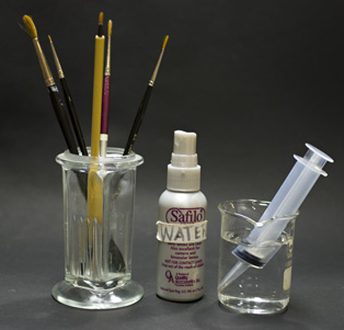
Progressively aggressive removal techniques range from gentle-to-vigorous agitation in the water trays, to misting with water (a little bottle that originally contained lens cleaner works perfectly, just make sure to clean the bottle well before filling with water), to using a plastic fine-tip syringe filled with water directed at small target areas.  Finally, areas that still have resisted pigment removal can be carefully touched with a tiny watercolor brush, followed by a dip in a tray of clean water. 

Although I often remove a little pigment here or there with a spray bottle or a plastic syringe, pigment removal with a brush should be considered a technique of last resort.  It is very hard to achieve smooth, subtle pigment removal in a small area with a brush.  If you find this step repeatedly necessary, it is best to go back and adjust your negative.  Go into 'Actual Pixels', and with the 'Burn' tool, darken the negative enough to tenderize the area just a bit.  A little experience will show you how dark to go, and whether or not you need to feather out the density towards the edges in order to avoid an unnaturally hard edge. 

The creative opposite of selective pigment removal is selective pigment addition.  Sometimes it's just not possible to get that one perfect color you visualize from your color set.  This is where you by-pass your negatives and paint right on your print.   You can apply any color mixed with gum and dichromate.  Start with a practice print.  It might take a couple of practice runs to determine the right ratio of pigment to gum and dichromate, plus the correct exposure time, but it's fun and very satisfying.  And of course, this is the step you can use if what you are going for is a wild departure from realistic.

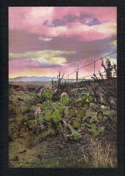
I painted the cactus pads with 'Sap Green' in gum and dichromate, followed by normal exposure and development.

A couple more tips:

1)  Never, ever, unintentionally touch the surface of a wet print.  The gum will come right off.  After the print is dry, it's almost invulnerable, but an 'Oops!' second of carelessness while the newest gum layer is still wet can ruin a printing session.  Remarkably, this trait is a powerful creative control tool.  Selective removal of gum is my favorite part of the whole process.  It reminds me that gum printing, for all the advantages of adding a computer to the process, is still a hands-on artisan craft. 

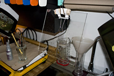
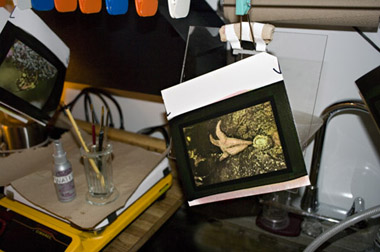
I keep a piece of acrylic hanging from the drying line above my waterbath developing trays, with a water misting spray bottle, a plastic syringe and various brushes close at hand.  After the last developing bath, if there are still areas of color I'd like to see less of on the final print, I pull the print out of the water and slap it gently onto the acrylic, being very careful to avoid touching the surface of the print. The water on the print holds it to the acrylic like a magnet.  This gives me a nice flat print to work on — hanging vertically and safely at eye-level.

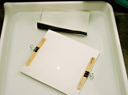
2)  After four or five layers of color,  a silvergum print can start to curl when it gets wet in the development trays.  A curled print will head straight to the bottom of the tray where it will inevitably suffer contact damage.  This is easily managed with wooden popsicle sticks and small binder clips. The print stays flat, and floating safe and sound on the surface of the water.  Leave the popsicle sticks on while the print is hanging to dry. 


The following are the color combinations I am using for my current silvergum portfolio.  Each of the representative layers posted here are individual prints, rather than scans of the sequential layers applied to one print.  This not only provides a permanent record of each individual color layer, it lets us see the subtle differences inherent in even the most carefully consistent workflow.  The differences that crop up in the 'tender zones' are most obvious.  Note the highlight block (last row, far left).  On some prints, the yellow has been completely developed off (i.e. washed off) to the clean white emulsion base.  In others, there's a hint or more of it left.  This allows you to decide how warm you want your highlights and gives you great control over the final print. Spectral reflections might need to be bright white, but the sunset light on a white building may want to have a warm yellow glow.  You decide during development. 

I use all Daniel Smith watercolors and D.S.'s liquid gum arabic solution mixed with 15% potassium dichromate.   Note: exposure times must be determined for each different light source.


 1) YELLOW:  In 20 ml gum arabic and 15 ml dichromate,

    0.7 g Hansa Yellow Medium
    0.1 g Hansa Yellow Deep
    0.1 g Naples Yellow


Note: The yellow layer sets the stage for the following colors.  The yellow mix here is for an image with strong yellows without an orange bias.  If you want a stronger yellow, you can add a bit more 'Hansa Deep'.  But, if for example, you were making a print of a pale yellow begonia, you could leave out the 'Hansa Yellow Deep' altogether, or even replace it with 'Hansa Yellow Light'.  It will not take you long to understand intuitively the best play of pigments for any individual image.  With the yellows, it's my experience that the three members of the Hansa family are equally compatible.


2)  +BLUE: In 20 ml gum arabic and 15 ml dichromate,

    1.0 g Verditer Blue


Note: You can get a stronger blue by adding a little 'Prussian Blue' to your mix.  This also gives your blue layer a faint cyan tint.  For some images, this may be enough to eliminate entirely the need for a separate cyan layer.  These kinds of decisions are image-specific.  In general, for most images, I am so fond of pure 'Verditer Blue', I choose to use it even if an extra layer of blue or cyan is required for a good final print.  'French Ultramarine Blue' is a good color, but I don't feel it's interchangeable with Verditer Blue in this set.  I have used it with 'Lemon Yellow' to nice effect. 


3)  +MAGENTA:  In 20 ml gum arabic and 15 ml dichromate,

    0.6 g Quinacridone Rose
    0.4 g Rhodonite Genuine


Note the lavender color in this print (top row, fifth column.)  It's tender on this layer and got a bit mottled during development.  This isn't necessarily a disadvantage. If you were printing a lavender flower, the effect would be subtle and beautiful. 


4)  +CYAN:  In 20 ml gum arabic and 15 ml dichromate,

    0.65 g Verditer Blue
    0.20 g Prussian Blue
    0.15 g Hansa Yellow Light


Compare this print with the one below.  Here, the initial yellow layer was much more intense.  Either the pigment layer went on thicker or the development was more gentle, or both.  For whatever reason, note the 'cyan' block (top row, last column).  It is more a yellow-green than a cyan.  If this were an image in which a pure cyan played an important part, you would want to be very careful to keep the yellow layer under control.


5)  +RED:  In 20 ml gum arabic and 15 ml dichromate,

    0.6 g Quinacridone Red


What to do with your red layer is a critical decision — image-specific, of course, but also determined by what has happened to your colors in the previous layers.  In this print, if a bright, 'cool' red was required, you could add a bit of 'Quin Rose' to counter the faint yellow tint that crept into the red.  Also, you don't have to use 'Quin Red'.  You can just as well use your magenta mix with a wee bit of yellow, either 'Hansa Medium' or 'Hansa Light', and I often do.

Note what happened on this layer to the olive/army green in the top row, fourth block.  The red exposure in that color is very tender and easily removed during development.  I can't block the green exposure completely in this layer without adversely affecting other colors.  If I wanted a cleaner color, I could always selectively remove the pigment during development.  With each successive layer, these decisions come increasingly into play.

Below is an example of an image printed with and without a Red layer.  Adding red not only strengthens the magenta in the flowers, it also adds depth to the green leaves.  Whether or not this is desirable is up to the artist.  Left: Yellow, Blue, Magenta, and Cyan.  Right: the same with a final Red layer (Quin Rose, Rhodonite, and Hansa Medium).  An additional note:  The yellow layer on this image used a bit of 'Hansa Light' rather than 'Hansa Deep'.  If I had used the stronger yellow the leaves would have been a warmer green even without the final red layer.


Many Options

It can't be repeated too often:  there are endless possibilities for making your work your own.   Like most artists, I carry around a mental collection of 'maybe someday' ideas and plans.  This is one of them.   I love the look of old, sooty frescos.  I think this workflow comes close to my internal picture of frescos.  'Someday' I'll put together just the right images...

For now, let's call this a '1 plus 3' color set.


This print is darker and 'heavier' than I would typically make, although the same idea of selective density control is used.  In this case, I lightened considerably both the reds and yellows.

The first color layer is actually a positive rather than a negative.  I made a thin transparency from the positive image file rather than a color separation negative.  I used this to print a layer of 'Naples Yellow' over the whole print.  This warms the entire image and gives extra warmth to the highlights.

Aside from the first 'warming' layer, there are only three color layers: Blue/Cyan, Yellow, and Magenta/Red.  The B-layer is with 'French Ultramarine Blue'.  The Y-layer is 2:1 'Hansa Yellow Medium' and 'Lemon Yellow', and the R-layer is 1:1 'Quinacridone Rose' and 'Rhodonite Genuine'.


Please go here for printable color separation baseline worksheets.


Copyright © The Light Farm