Orthochromatic Emulsions — Background and Basics
January 15, 2012It is a fact that we all take for granted. Black and white film records shades of gray 'logically'. If you take a b&w picture of a blue and yellow beach ball, you expect that the blue will record dark and the yellow light. Of course. Except, it wasn't always so. If you had asked someone in 1900 what a photograph of a blue and yellow beach ball should look like, they would have said the blue is light and the yellow dark. Their expectation of 'correct' was based on the colorblind film in use at the time — their technological/cultural frame.
The first silver gelatin negative was straight silver bromide and gelatin — a combination sensitive only to UV and blue/violet light. The blue on the beach ball exposed well — the yellow much less so. The print of the negative reversed the values and blue became light and yellow dark.
In 1884, Josef Eder discovered that erythrosin dye caused an emulsion to become sensitive to all light except deep orange and red. Blue eyes were no longer a ghostly white, but everyone still 'knew' that a woman's lips photograph black. The emulsion was dubbed ortho-chromatic, implying its 'correct' color balance. (This was a bit of premature marketing. When emulsions added the deep orange and red bands of the spectrum, marketers had to come up with a new name — panchromatic, meaning 'all colors'.) Orthochromatic emulsions and colorblind emulsions were in use simultaneously for years. At the time, colorblind plates were more commonly referred to as 'ordinary'.
That's the bare bones, but the whole picture was amazingly complex. Different brands and types of plates and films were sensitive to different exact wavelengths of light. Between orthochromatic and panchromatic is a whole range of red sensitivities. Back in the day, a typical photographer might have worked with a half dozen different films, and a dozen different filters to further tweak the materials.
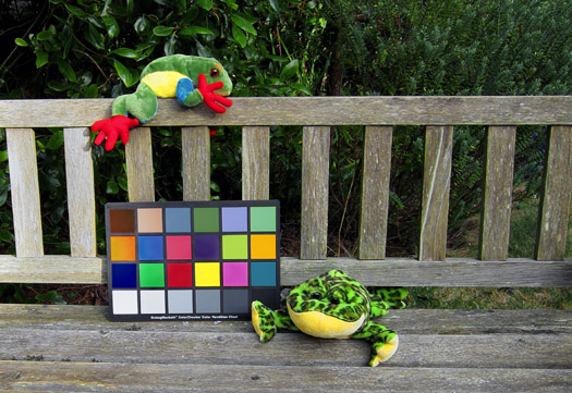
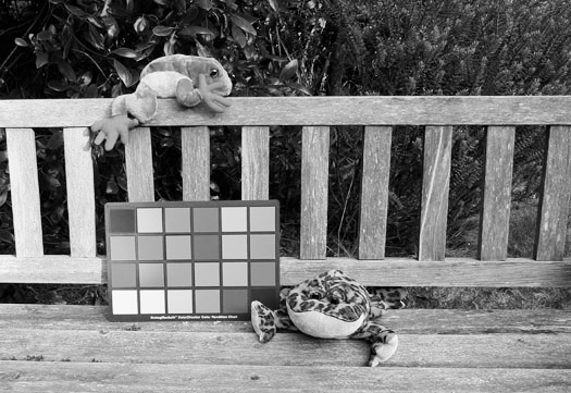
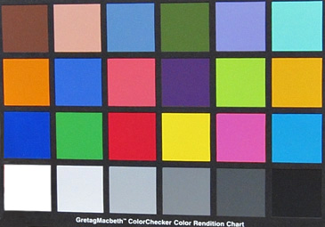
I'll start with one of our current technological/cultural expectations of a black and white image — the desaturated color digital file.
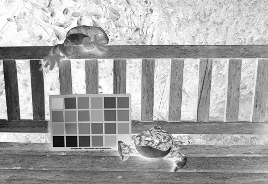
And the inversion/negative.
The black and white values pretty much fit our expectations. Yellow is bright. Blues, greens, and red all have about the same value. The light shining on half the color card messed with the densities more than I anticipated (the gottcha of reflectance).
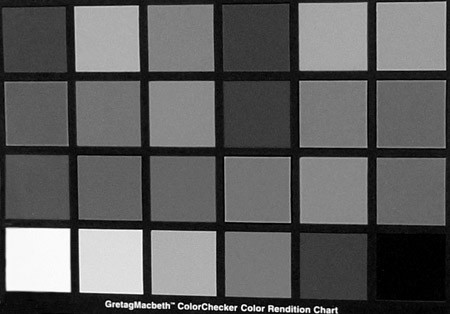
Here's the card photographed in even shade and desaturated. To me it 'feels' wrong. There isn't enough difference in the brightness levels. The oranges and yellow-green should be brighter. The dark blue should be darker.
I have no idea whether my expectations are based in physical facts or on an expectation of 'reality' based on my experience with B&W panchromatic film. It doesn't matter. I can change the values in post-processing. Our 'back-in-the-day' photographers did it with film choice and filters.
Artisan emulsion makers have the last century of photography to play with.
An ordinary/colorblind emulsion, like 'TLF#2', is sensitive to UV and blue/violet light. If you add a spectral sensitizer, you will pick up an extra band of color, but the emulsion will still be over-sensitive to blue. With orthochromatic emulsions a yellow filter is required for full effect. The filter holds back blue light exposure and allows yellow and green light more time to expose the negative. Unfortunately, a price is paid in 'speed'. A medium-yellow filter will increase exposure time 1x - 3x.
Note: I'll be comparing a lot of ColorChecker Charts in the coming months, so I've settled on a simple, repeatable protocol, not necessarily intended to produce the most pleasing print.
The negative is a straight scan at 4000 d.p.i. The full print is crop, invert, and auto-contrast. Since shadows are always the default black point, the chart black will almost never be as dark, so I'll make a last crop of the chart alone and set the black point on the black square. All other values fall automatically from that.
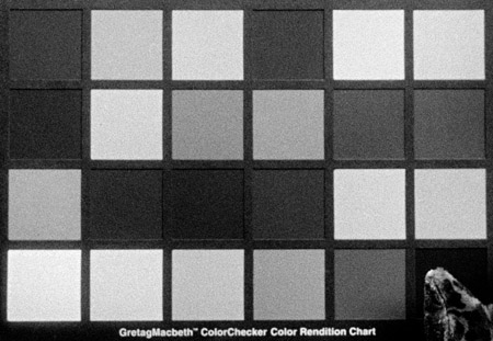
Left: The GretagMacbeth ColorChecker photographed with colorblind 'TLF#2'.
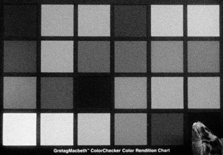
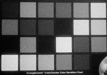
And an ortho variation exposed without a filter (left) and with a medium yellow filter (below).
Continued...