Color
November 25, 2013When you've got going a big, long-term project like TLF, it's hard to know how much of the sausage making to show. Research is never perfectly linear, and there is a lot of the work that doesn't make for compelling entertainment. It's hard to know how much to write about, and how much background info to include. I've decided to err on the side of more rather than less and trust that most people reading this are here for information. I suspect the ADHD among us have long since departed and since there is a lot of stuff that is worth looking at and thinking about...onward!
There are a gaggle of ways to achieve a color print starting from black and white materials. The easiest of them start with a three-color separation—taken separately or simultaneously—with a combination of film types, or with only panchromatic film.
Picking up from the last TLF Tutorial on Sept 4.
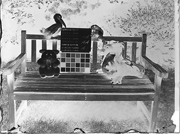
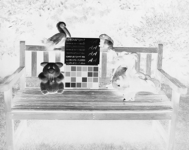
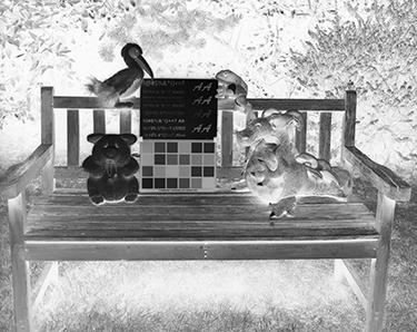
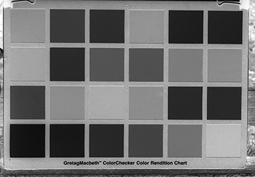
Left: An 'AmBr-Panchromatic' plate exposed with a medium-yellow filter (Y8/K2). Below left: 'AmBr-Ortho' film exposed with the same filter, and below right: 'AmBr-Colorblind' film exposed without a filter.
The set can be used as a three-color separation, and back in the day, often was. Before panchromatic film, two-color separations were used to create color images, with colorblind and ortho, or ortho unfiltered for one layer and filtered with yellow for the second layer. This resulted in a slightly limited palette, but worked surprisingly well for most images, especially portraits.
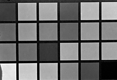
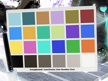
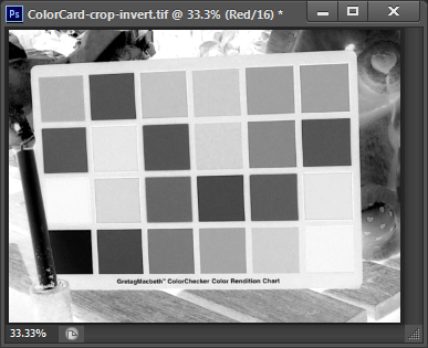
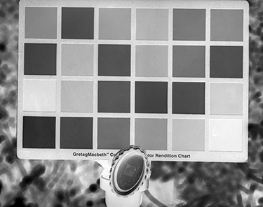
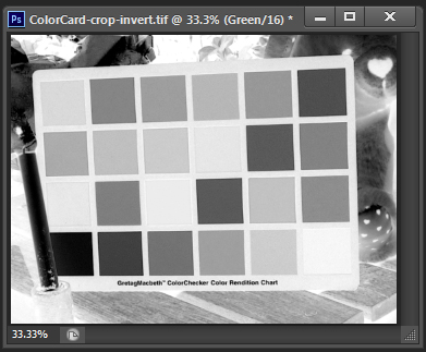
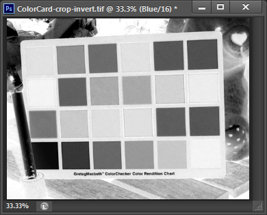
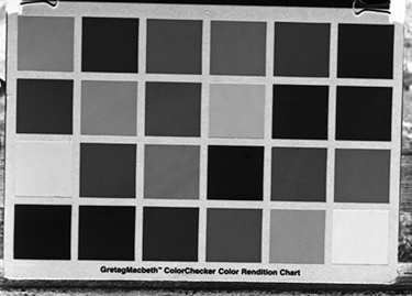
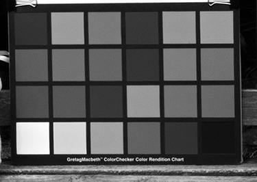
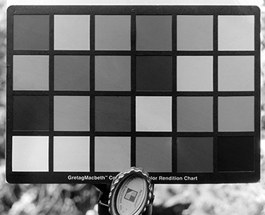
Below: A digital capture of a GretagMacbeth ColorChecker chart, and the file inverted in Photoshop.
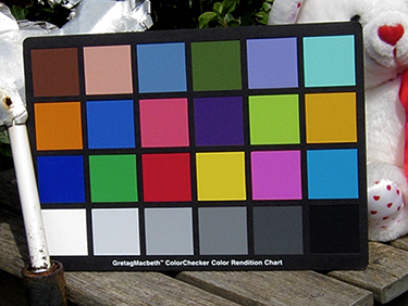
Photoshop (PS) can split the negative into three channels: red, green, and blue, or RGB. These are the three additive light primaries that when mixed form all other colors, including white—the sum of all three. Or, you can use panchromatic film and three color separation filters to make three separation negatives. If you then dye each positive made from the negatives with the appropriate color and superimpose the layers on each other, or project them together with three overlapping colored lights, you get back to the original color image. This is the way a color photograph or projection was made before there was color film. It is still the idea behind a three-color carbon or gum print.
Not surprising, the PS channel splitter algorithm lines up very closely with the physical separations made with panchromatic film and separation filters.
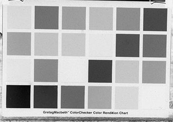
Below left: The PS red channel separation. Below right: A red separation negative made by exposing 'AmBr-Panchromatic' through a #25 red filter.
Below left: The PS green channel separation. Below right: A green separation negative made by exposing 'AmBr-Panchromatic' through a #58 green filter.
Below left: The PS blue channel separation. Below right: A blue separation negative made by exposing 'AmBr-Panchromatic' through a #47 blue filter.
Now, a comparison of the film versions of the above two sets. On the left are the separations made with colorblind, ortho, and panchromatic film. On the right are the separations all made with panchromatic film and RGB separation filters. The green and blue separations are very close matches with their ortho and colorblind counterparts, but the panchromatic negative exposed with a yellow filter isn't as good a match with the PS red channel as the same emulsion exposed through a red #25 filter.
Below left: 'AmBr-Panchromatic' exposed through medium yellow filter. Below right: A red separation negative made by exposing 'AmBr-Panchromatic' through a #25 red filter.
Below left: 'AmBr-Ortho' exposed through medium yellow filter. Below right: A green separation negative made by exposing 'AmBr-Panchromatic' through a #58 green filter.
Below left: 'AmBr-Colorblind', no filter. Below right: A blue separation negative made by exposing 'AmBr-Panchromatic' through a #47 blue filter.
So, all this just begs a question. Why bother with three separate emulsions when panchromatic with separation filters works the best?
It comes down to intended use. Both approaches require a very sturdy tripod so that each negative is identical in registration. The exposures made with the separation filters, which are very dark, take a lot longer than the exposures made with a yellow filter, but that factor is basically relative. For an image capture that involves three separate exposures it really doesn't make a difference—as long as the subject is absolutely stationary throughout all three exposures. But, where I live, that's not going to happen anywhere outside my studio. I become a very cranky girl if I'm locked up in a studio for long.
With a single exposure shot, a little motion isn't usually objectionable. Grass blowing in the breeze or a blurred speeding car can be a planned part of the final image. But, when you are photographing even the slightest movement with three separate exposures, the unavoidable discrepancies between exposures will result in color fringing in the final composite print. The solution to this problem is to get all three exposures at the same time. Then, any movement is the nice blur that our eyes and expectations accept. Most recently, photographers used beam-splitter cameras that took light in through one lens and directed it to three separate negatives through their respective RGB filters. It was a great system but the cameras are no longer made and if you can find one intact it is still deathly expensive. No longer an option.
The solution is to go back a generation in technology to the tri-pack, three pieces of film crammed up tight together with filters in the right places. The usual sequence, from front to back, is colorblind/Blue, yellow filter, ortho/Green, red filter (optional—depending on how close you need this layer to hit the red separation ideal), and finally panchromatic/Red.
The trick is that each successive layer has to be increasingly sensitive to light. Colorblind, ortho, and panchromatic emulsions have this stepped sensitivity built into their natures. Still, it is a delicate balancing act when you add in the tonal balance required to achieve correct color balance. That's where I'm at right now.
Although this page is about color, this is also as good a place as any to talk more about panchromatic capture.
The following three images are all digital—the straight color file from a Sony Cybershot and two different ways to get to monochrome. I think that the file desaturated in Photoshop CS6 is a horrid interpretation. It doesn't match the human eye's perception of tonality (at least this human). The most colorful scene would be rendered a flat smoodge of boring. Lightroom does a much better job. Still, my eye sees greens as being lighter than blues and purple. Lightroom doesn't interpret that distinction. Fortunately, it's fairly easy to go in with additional tools, primarily 'Selective Color', and fix things to your liking.
Below left : Photoshop desat tool.
Below right: Lightroom's B&W treatment.
By comparison, panchromatic film, just by its inherent physical nature, does a far better job at recording what my eyes see. Below right: 'AmBr-Panchromatic' exposed with a yellow filter.
Interestingly, the panchromatic film ('AmBr-Pan') exposed without a filter (below left) is a fairly close match with the Lightroom treatment of a digital capture (below right). Throughout the history of photography, the conventions for what "looks real" have paralleled the technology. Most recently, using filters has become much less common. This trend paralleled the latest advances in film that made the emulsions proportionally less sensitive to blue light. You can get a reasonably dark sky with visible clouds without using a yellow filter and then jack up the contrast with variable contrast printing paper, or, of course, in Photoshop. Is the Lightroom algorithm just following the latest convention? If so, it's still taking film as the standard. Over the coming years, it will be interesting to follow the changes in what is perceived as looking real.