19. Deep Dive, part 4—AmBr for Color |
|
|
|
The pieces are coming together for color photography. It all hinges on tricolor separation—and there are a number of options open to us as d.i.y.'ers. 1) Three separate, sequential exposures using color separation filters with panchromatic emulsion, 2) Screen plates/films with panchromatic emulsion: autochromes being the most famous example and 3) Tri-packs: three pieces of differently sensitized film sandwiched together and exposed at the same time. The combo has a necessarily slow speed. More on that later. In the past, various cameras were sold with sliding backs or with mirrors. Because the mirror cameras expose three separate and separated sheets of film at the same time, they have the advantage of motion capture. Unfortunately, no one today makes the cameras. The Devin and Curtis tricolor cameras still come up on ebay—rarely though, and usually broken yet still very expensive. For myself, I am considering specialized cameras a non-option. In this tutorial, we will be looking at option #4: using the inherent spectral sensitivities of the three basic emulsion types to produce tricolor separation negatives using only a yellow filter. |
|
|
|
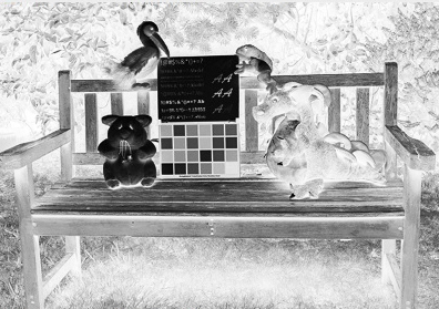
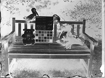
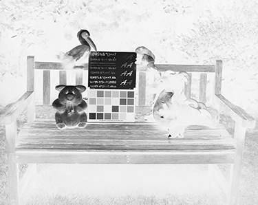
Color Channels If you aren't a three- or five-color gum printer using Photoshop and your inkjet printer to make your negatives, you may not have played with the Channels tool. Electronic imaging devices, and the software that facilitates their use, "see" using black and white separation channels to create the color we then see. A mountain of information is available about this elsewhere and the theory and engineering are fascinating—fun, valuable reading that I recommend. There is RGB and CMYK, and variations on each and others. It gets complex, and I can't pretend to understand all the physics, electronics, and programming, but fortunately in practical application it is very straightforward. Think blue/cyan, red/magenta, and yellow. All colors are a blend of these three color families. "Reflective", "transmissive", "additive" or "subtractive". Whatever approach you take, it all comes down to the colors and how we, as artists, choose to combine them. Understanding the theories and distinctions can inform our process, but this is hands-on and to a large degree subjective. Play. If we start with a color file, invert the image and then open "Channels" and select 'Red', 'Green', or 'Blue', we see three different black and white negative images. The channels are exactly what you think. They mimic panchromatic film exposed through, red, green, and blue filters. The filters darken their own colors on the negative and therefore lighten on related positives. |
|
|
|
For quite a while now it has been standard practice when making tricolor separations to use narrow cut filters with panchromatic film. Interestingly, that became true only after colorblind and ortho films went off the market. Defender Photo Company sold a colorblind film that they named "Blue Record" at the same time as they sold ortho and a range of panchromatic films. It was accepted that there were distinct advantages to using three different films rather than only panchromatic. With the first technique, only a yellow filter is required. Yellow filters have much higher light transmission than the red, green, and blue filters in a separation set. That translates in practical terms to greater film speed. This isn't necessarily a big deal for landscape photography, but film speed can make or break shooting studio still-lifes with artificial light. |
|
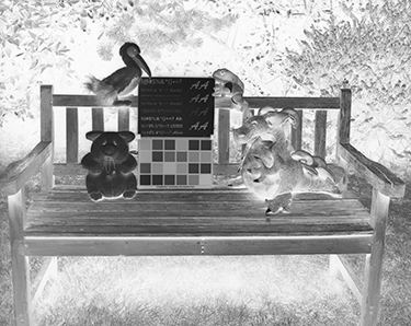
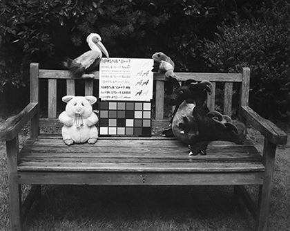
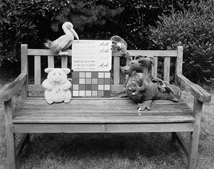
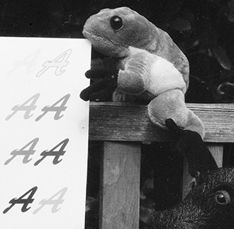
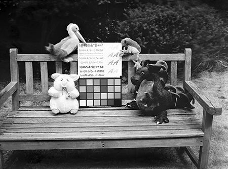
Here's how it looks. The digital channels again, on the left, with the corresponding AmBr emulsion matches to their right. From the top: R is panchromatic with a yellow filter, G is ortho with a yellow filter, and B is colorblind film without a filter. The panchromatic negative is on a glass plate. I wasn't as careful with the edges as I usually am. Blame excitement and impatience. The ortho and the colorblind negatives are on Dura-lar Wet Media film.
|
|
|
|
|
|
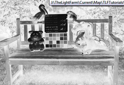
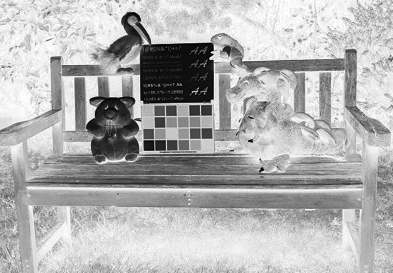
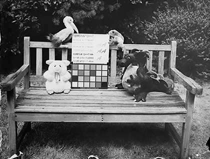
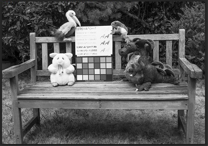
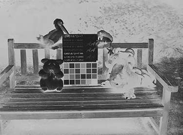
The prints made from each of the 'AmBr' negatives
|
|
|
|
And crops from the above prints. |
|
|
|
|
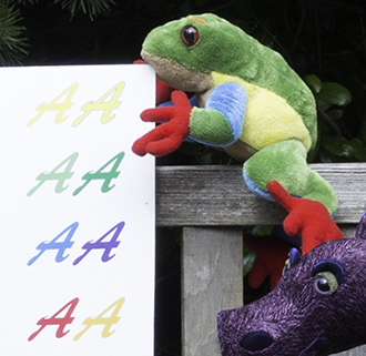
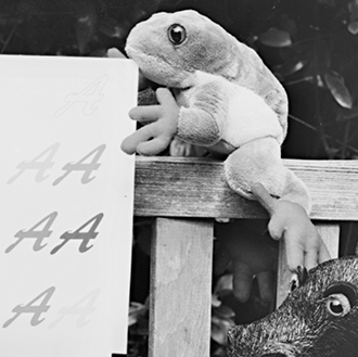
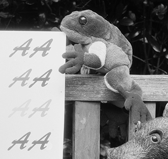
Our emulsions can be tailored to our tastes and needs more than you might suspect. I know I've only scratched the surface. You might have noticed that my panchromatic plate above doesn't exactly match the digital rendition. Both the greens and yellows are lighter. That's because of the generous amount of yellow screening I added with the finals. Below (lower left) is a version made without the yellow screening dye. It's a much closer match to the digital standard. Starting in the upper left and moving clockwise: A positive of the digital red channel, the AmBr film negative, a crop of the AmBr print, and the full AmBr print. |
|
|
|
|
|
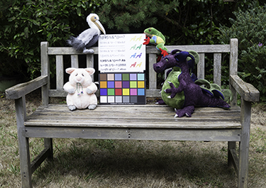
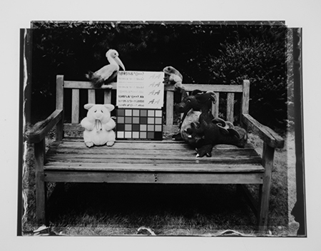
OK, time to summarize a few points by way of a segue into the unknown, a.k.a. R&D play. The negative above is far better than the glass plate negative in the separation set— olor rendition aside. That aspect is subjective. Negative quality is not. The glass plate is overexposed. Overexposure is more of a problem on glass than on film. It is very hard to get halation on film. All too easy on glass. Although halation can be beautiful, it is often accompanied by irradiation, which obscures detail. This is why you can see the yellow A's on the film negative but not on the glass plate. Not only detail is obscured. Too much exposure spreads the spectrum a bit on either side of each color recorded. The end result of this is that all the colors are a little less clear—essentially, less saturated. Overexposure also changes the color balance a bit. Blue light becomes over-represented, exaggerating the Type A characteristics. Note though, that although the film negative is exposed correctly for the color chart and for Pelican, Frog, and Pig, Puff the Magic Dragon is very much underexposed. Although this may or may not be an artistic issue for a stand-alone print, it would be very much an issue if the negative were part of a tricolor set. Even if Puff's density were perfect in the B and G negatives, in a three-color print he would still print out darker than desired and probably the color balance would be off. All three negatives must be in balance. Figuring out exactly what "in balance" means will take a little work. I'm certainly not there yet. Also, I haven't decided if the faint purple color of the pinacyanol chloride that dyes the subbing on back of the film is a problem. It doesn't happen on the glass negatives. At the same time as you are figuring out the right density balance and achieving it with good exposure and contrast control development, you will be thinking about color balance. The late Katherine Thayer, a pioneer in modern gum printing and a great artist, coined the phrase "not all colors play well together." Red is a particular bully. It takes a special red to not dominate and distort the other colors. The negatives dye beautifully, so eventually (fingers crossed) three perfect separation negatives, dyed with the perfect shades of blue/cyan, red/magenta, and yellow, will be playing well together. |
|
|
|
The next stage: working through a lot of questions |
Do the positives of the negatives stack together and give you the density range and appearance you want? Will you be making a color negative and inverting it, or a color positive presented as a transparency? These positives are inkjet diginegs printed on Pictorico OHP from inverted files of the scanned AmBr negatives. By playing with Photoshop curves, I should be able to get a better idea of what's required to achieve a good density balance among the three negatives. |
|
|
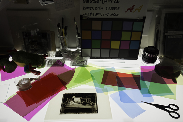
What's the general color profile look like? Colored cellophane is perfect to easily and quickly experiment with different color combinations, but I'll have to find a source of better reds. The magenta and red I found locally are hopeless thugs, but they worked well enough to make me believe this is going to be a lot of fun. 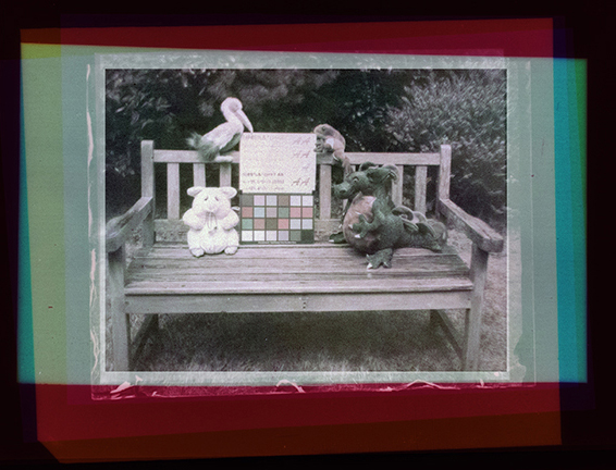
Cellophane behind the negatives in registration.
The conversation continues here. |
|
|
|
Continued... |