4. Understanding the Color Response of Colorblind Materials |
|
If you’ve come to photography since digital became the norm, or if you have only used modern commercial B&W film, you may not be familiar with the way colorblind and ortho materials record color. It’s different and it isn’t necessarily straightforward. With the exception of monochromatic cameras, digital cameras and modern film are panchromatic. The name implies all color, and they get amazingly close to that. Before panchromatic, orthochromatic film was the latest, greatest. The name implies “correct color,” but it was correct only insofar as it was closer to the way our eyes perceive than the colorblind materials that came before. Even the name “colorblind” strays a bit from reality. The film sees UV color that is invisible to our eyes into the violet and blue light wavelengths. The other colors/wavelengths are more or less undetectable to the film. If a color is recorded as density on a negative it is because of the UV, violet, or blue light that reflects off a given surface. Because UV levels are variable — dependent on the season, the weather, the time of day, and latitude, it is impossible to give a colorblind/ortho emulsion a single ISO number. We need to work within an ISO range. Even the developer used influences the speed of the material. This is the reason the first photographers to adopt the materials carried elaborate speed charts. Making our own custom charts is very useful. Be aware of light temperature. We are all familiar with “golden hour.” The light at the beginning and end of a day with clear skies is warm. Yellow, orange, and red predominate in the light. A colorblind emulsion will require more exposure than a typical exposure meter might indicate. At high noon on a clear day, it will be the opposite. Depending on the color of your primary subjects, you’ll need to think, always, about giving more exposure or less exposure than your meter indicates. High elevations are particularly tricky. My advice: bracket! Pictures are better than words. |
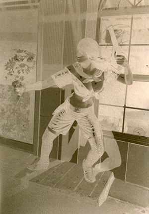
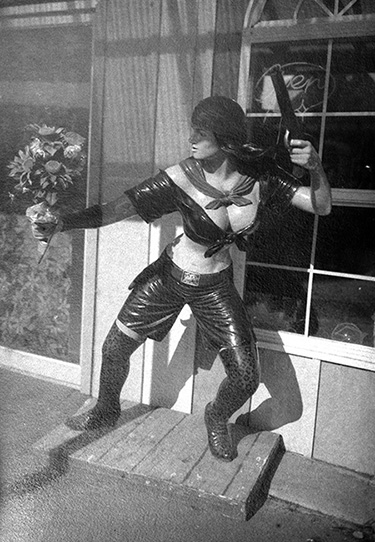
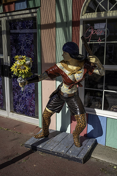
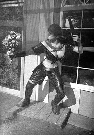
“Lady Pirate” at Aquarium Village, South Beach/Newport, Oregon: paper negative Left below : “Lady Pirate” at Aquarium Village, South Beach/Newport, Oregon: paper negative print Right below: Digital print |
|
|
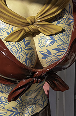
Compare the paper negative with the matching digital image. Our eyes perceive yellow as lighter than purple. The color response of the paper negative brings those values much closer together. The artificial sunflowers are as bright as they are because most polyester fabric has UV brighteners. It’s easy to forget to take this into consideration when you have a subject with a lot of fabric. Plush toy animals practically throw the UV light back at you. If crafting the values in your photographs is important to you, learn to see the temperature bias in the colors of a scene. The color panels of the painted wall behind the Lady all seem like they would record about the same value of gray in monochrome. The reason they don’t is because one blue is a cool blue and one is a warm (i.e., yellow bias) blue-green. |
|
Information can be lost because of the way the emulsion sees color. The blue tattoos disappear in the paper negative. |
|
Left: Paper negative crop Center: Digital file, desaturated, crop Right: Digital file, crop 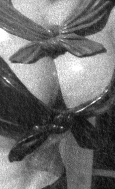

|
The good news with paper negatives is that if you have recorded the information, you can essentially paint with light using the Photoshop Burn and Dodge tools. Here, I brightened the flowers and darkened the purple panel behind them. |
|
Clouds are a classic example. I could have recorded the clouds on the ortho sensitized negative if I had used a yellow filter. However, it’s a devil’s deal. A yellow filter would have ruined the luminosity in the shadows. Luminosity is the gift of colorblind materials. |
|
|
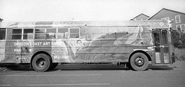
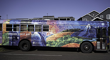
Some images may be lost causes. I don’t know if a yellow filter would have separated the colors on the Oregon Coast Art Bus. |
|
|
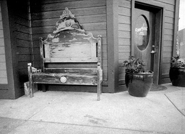
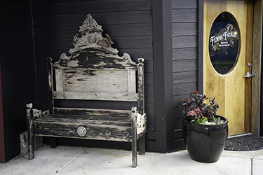
One more: The yellowish door is dark, but the shadows are bright. |
|
|
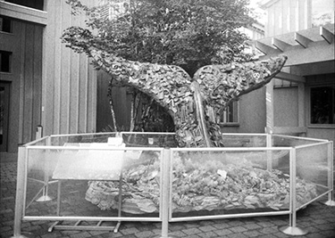
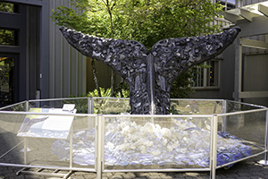
The heightened sensitivity to UV can very much work in our favor. The Whale’s Tail, made from beach trash (part of the magnificent “Washed Ashore” exhibit at the Oregon Coast Aquarium - summer 2025) jumps out in the paper negative print and fades into the background in the BW version of a digital file. |
|
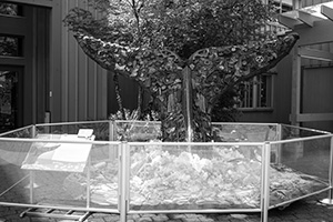
Left: Desatured digital file |
|
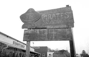
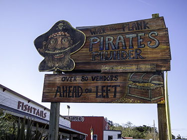
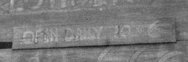
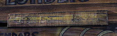
And finally, the “magic effect.” No surprise that the dark reddish-orange sign records dark and low information, but can you find the information in the paper negative that is invisible in the digital picture? The paint must have a high UV response. Pirate’s Plunder sign, digital and paper negative. |
|
|
| < 4/8/25 Rogue Brewery > |